Saturday, March 26, 2011

Biographies Project

For my typography class, we were given a biography assignment. We had to pick 5 well documented people that are somehow connected and design something. It had to include a photo, a bio, a timeline and a list pertaining to each one.
Naturally my 1st thought was elvis! (with a little influence from MDQ) I thought I would design a box set paying homage to Sun Records and designing records for the top 5 most famous Sun artists: elvis, jerry lee, perkins, cash, and roy orbison.
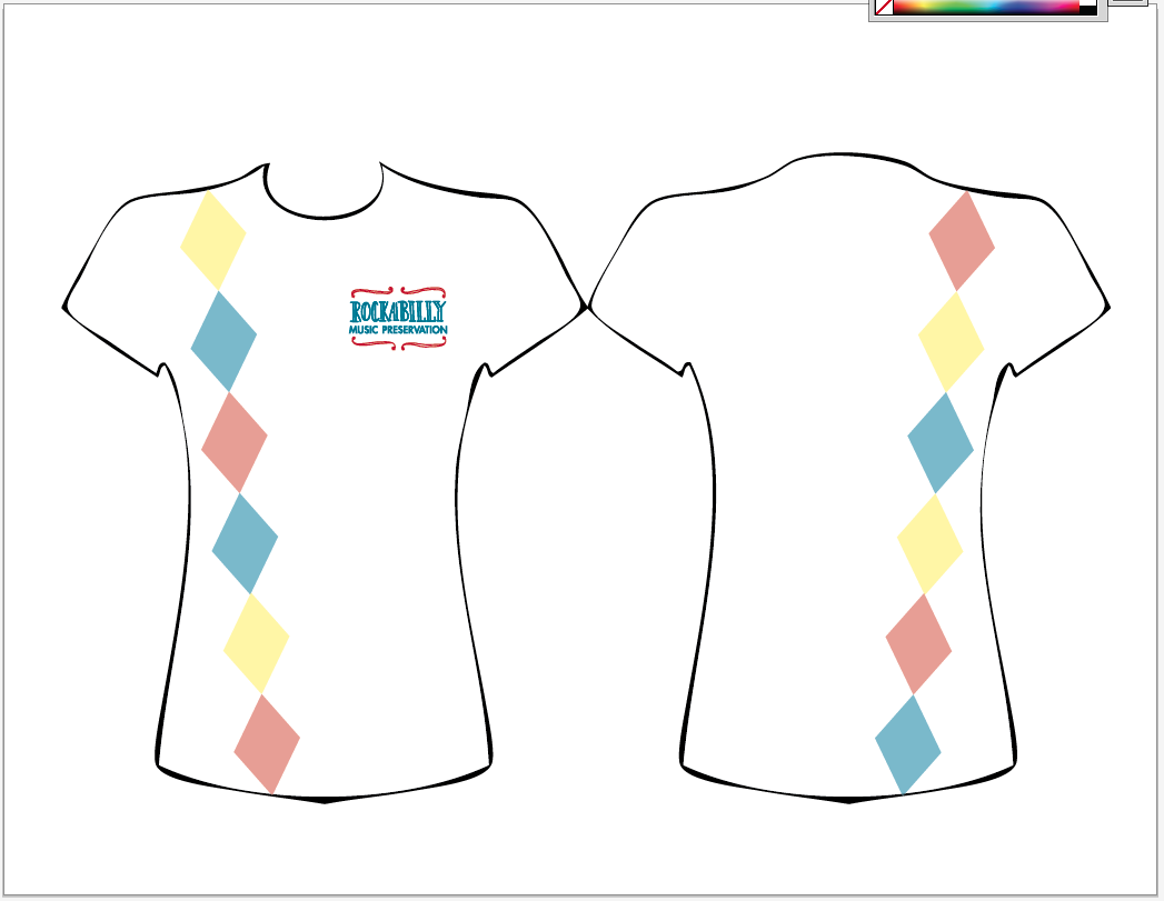
Then I though, this is going a bit too far. I'm already branding the Rockabilly Music Preservation (which wasn't directly influenced from MDQ... I just really like that music). So I came up with another idea. I wanted to do something with NFL quarterbacks (mainly because I really wanted to do a project that included Mark Sanchez... and then I couldn't leave out Eli). Obviously that concept didn't go much further than that. My teacher liked the record one better.... soooo that's what I ended up doing.

I was going to design 5 album covers along with the backs, the label on the records, then a book; one side which includes the bios and the other the timeline.

Frontback

Frontback

Front back

Frontback

Frontback

Labels that will go on the records:
The book:
timeline

 bios
Although they aren't able to read on screen (since their size is 36x12") they will be back to back and accordion fold.


Rockabilly Music Preservation Identity

For my communication graphics class I chose the Rockabilly Music Preservation as my client to build a corporate identity for.

We first had to design their logo which took about 4-5weeks
Next we had to design 5 different business cards and double page ads. I've only included the ads here. Luckily I was able to use my photos for all except one ad :)
1.

2a.

2b.

3.

4.

5.
Next we are designing promotional t-shirts as well as the website. 
1.

2.

3.

4.
This project is so much fun, yet so challenging. I get to design for something I love, but it's such a distinct style that has so much history, I have to make sure I stay super true to it. At the same time though, I am given so many different ways I can design things because it has so many components.

And i just got an idea for another shirt design (even though we need only 3)
I must get to designing it.... andd GO


Sunday, December 19, 2010

Self Identity ~ Final

Business card (front and back)
1.
2. (without phone #)

Letter heads
1.


2.

Blog
Blog logo
1.
 2.

I was thinking of different names for my "self company" and i didnt want just my name (lauren machlica design). My nickname to many people is Smiles or Lauren Smiles so i wanted to play around with that. I started with Lauren Smiles Design which i really liked but when i was messing around with the type i realized that the abr. is LSD... not sure if i want that. Im trying to rearrange is some how so i can keep it, but for now i just stuck with Smiles Design (which isn't taken by anyone... at least not online)
The blog isnt running yet because im still trying to figure out how to change everything the way i want them to look... which apparently should be easy.

Broadway App ~ Final

Broadway Search app final

Saturday, December 18, 2010

Info Graphics ~ Final

Info Graphics Final


Type Specimen Book ~ Final

Type Specimen Book final 


when i get more time i might want to add some abstract watercolor forms to the "M" spread so there isn't all that negative space. but im still contemplating that

Wednesday, December 8, 2010

Identity

We came to a conclusion that this was the best business card to define me. I changed the text on the back from i believe caslon to neutra text to make it look more modern like the front is

I next started the letter head. i wanted to take the counters of all the 8's in my number and make a sort of fun light hearted letter head. I like bubbles and bubbles are fun. however i think this one might look too childish/too non professional/ too much like the paper you'd get at a craft store... 
I also began a blog background to go with it. The gray area is where all the posts would go and it would be a little translucent. There is obviously no text yet on the blog. I still have to make the title


I began another set of letterheads and blog background. This time i still wanted to keep with the "bubble" theme but i toned it down a bit on both. 


The name im thinking of is something like Lauren Smiles or LEM Smiles since 'smiles' has so much to do with my personality and how i look at life and how i approach projects and everything. 

Feed back would be LOVELY!